CLIENT

Landing

SERVICES

Visual Design

Iconography

Membership to a fully furnished apartment
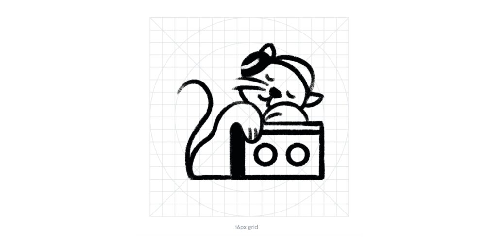
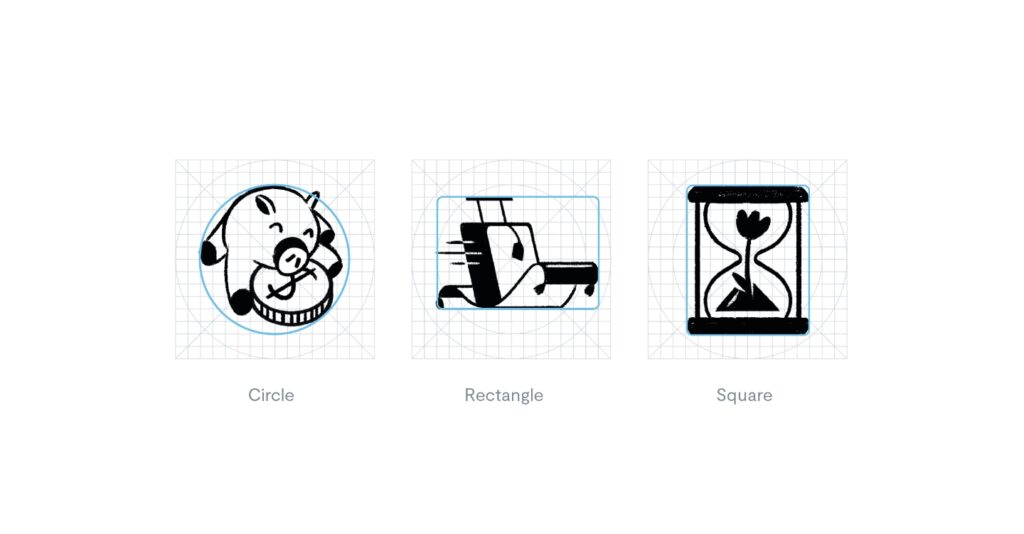
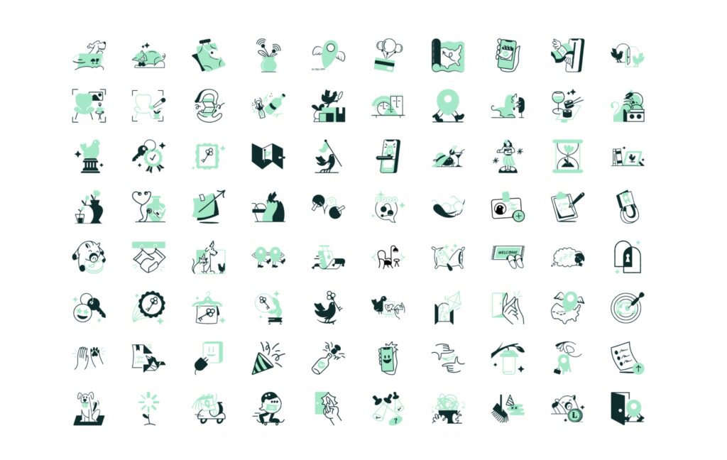
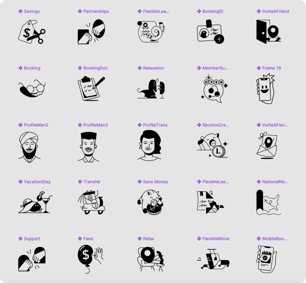
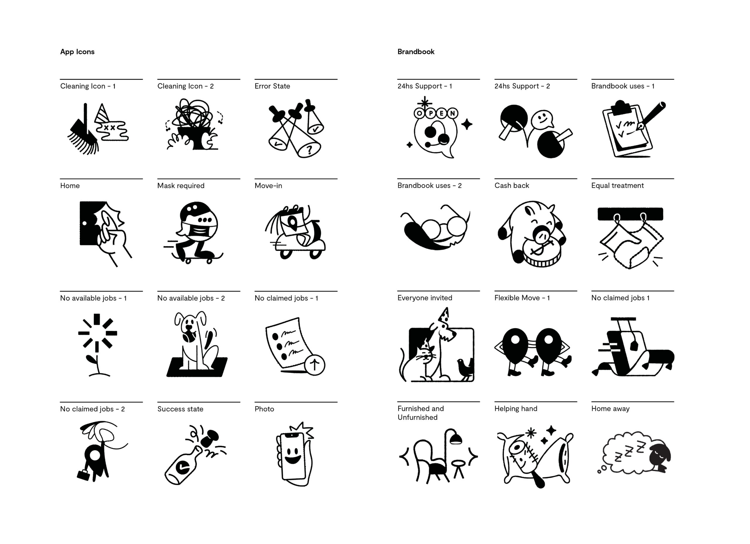
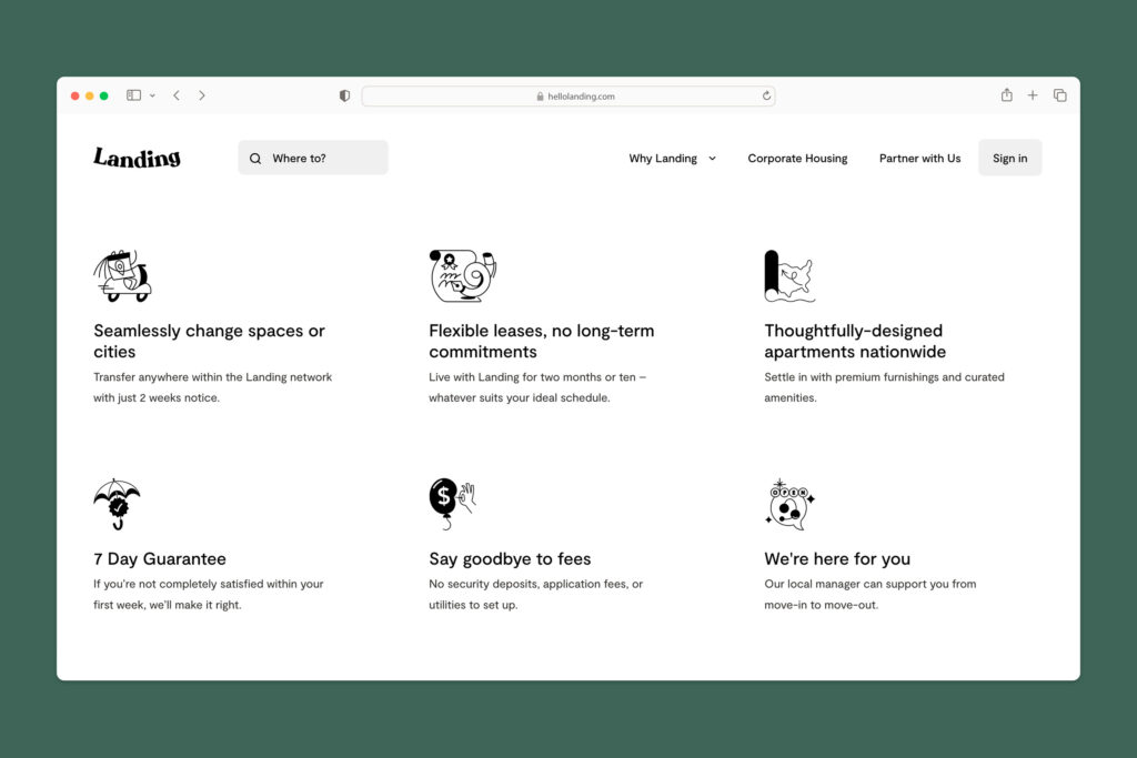
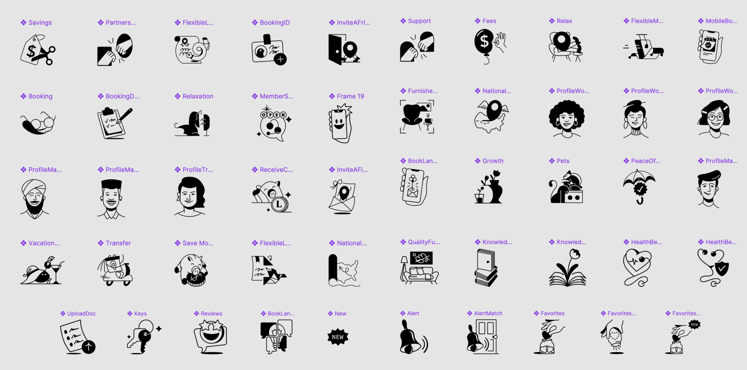
Landing is not only a way of living life, it is also a way of seeing it. How complicated is so simple and how sophisticated is accessible. The idea was to create a connection between the old and the new using technology, a relaxed atmosphere and comfort as a bridge. All those things that distract us from the feeling of nostalgia. To do this, I made an icon system with a flexible grid that allows design team to play with various simple or complex elements.

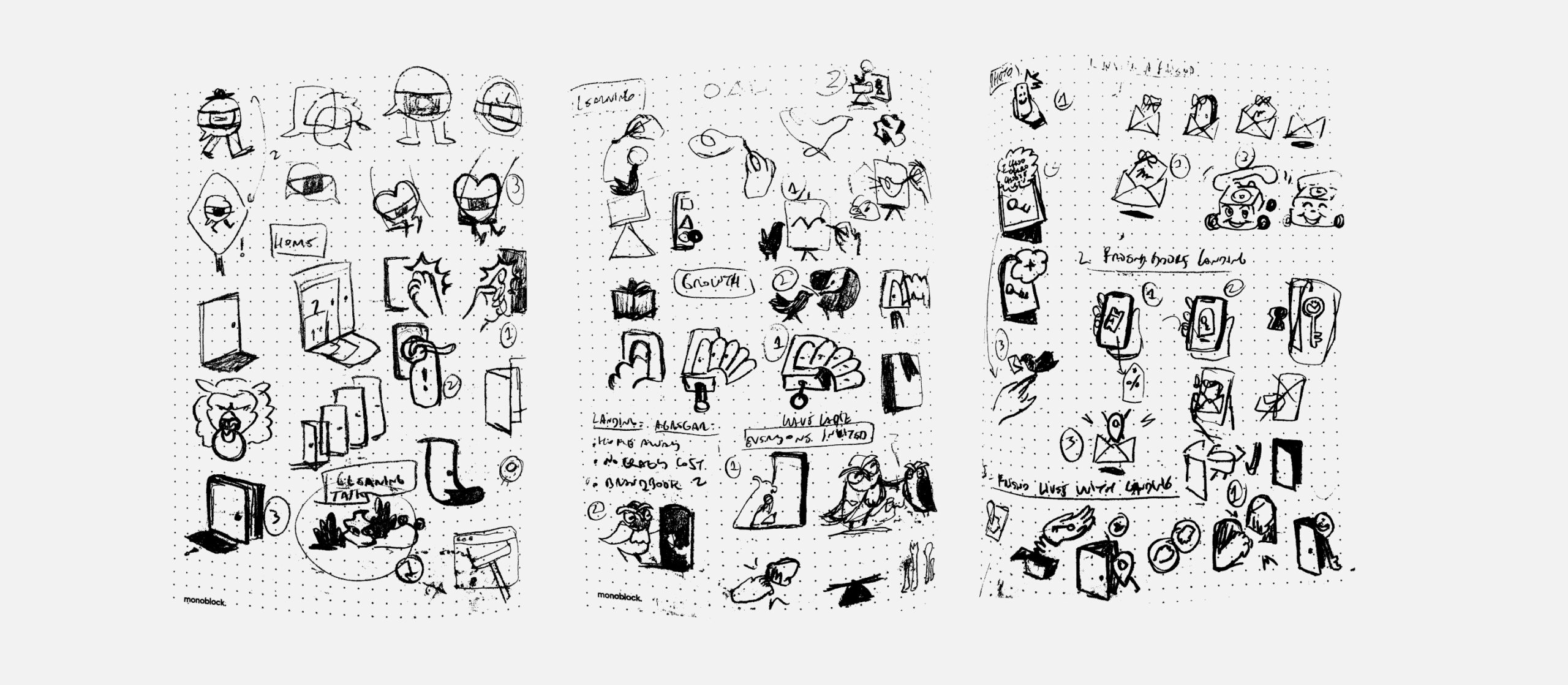
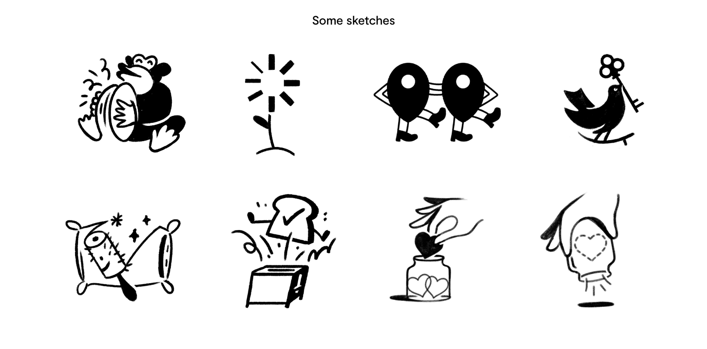
Together with the head of design and product designers, we identify the platforms or applications where the icons will be used. We then determine the target audience and their preferences. When making the initial sketches of the icons, we pay special attention to the use of metaphors, visual coherence, simplicity in the design and that the design is made in vector.

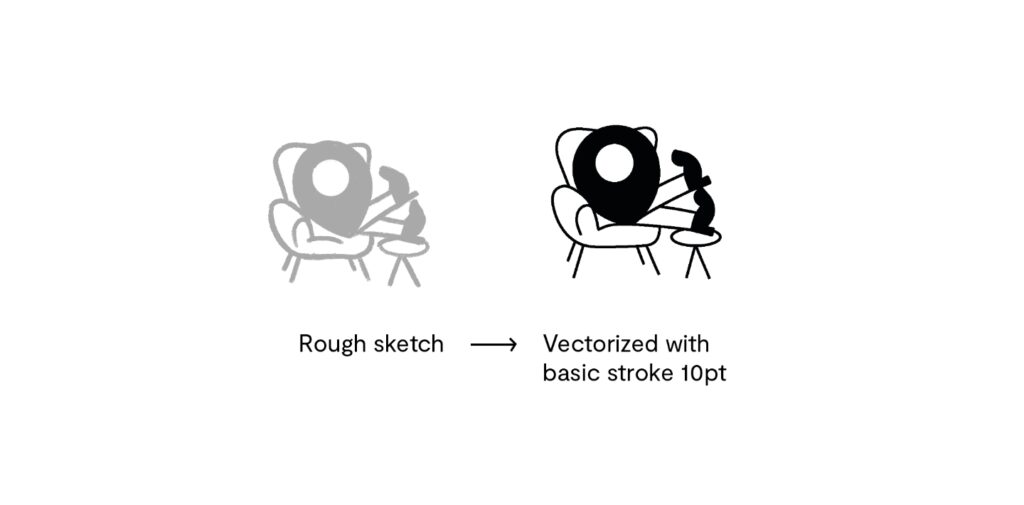
Continuing with visual coherence, we define the style (stroke type and size), color and size. Then we tested the legibility and clarity of the icons in various sizes. Finally, we developed a comprehensive style guide documenting the specifications for each icon, including size, color and usage guidelines.